


Insights Into the Topics of the Exhibition
SERIES: Prints from Warhol to Wool
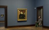
What do artists find so fascinating about series and, even more, about serial repetition in printmaking? With his famous »Campbell’s Soup« series (1968), Andy Warhol (1928–1987) made the serial repetition of images in silkscreen printing his trademark. Through Pop Art and Fluxus, prints thus became one of the prime artistic media in the mid-1960s. New graphic techniques such as silkscreen printing and offset, often coupled with bold colours and high-impact motifs, enabled not only large print runs but also making use of images from the popular print media and advertising. As early as 1968, the Hamburg Kunsthalle acquired Warhol’s famous »Marilyn« series (1967), which, with its flamboyant colour variations, ranks among the most important series in American Pop Art. The very same year, the museum added Josef Albers’s (1888-1976) »Hommage au carré« (1965) to its collection, another milestone of serial art. These works would lay the foundation for the Department of Prints and Drawings’ outstanding collection of contemporary print series. Since then, the collection has been systematically expanded, from key works of Minimal and Conceptual Art by Donald Judd (1928–1994) and John Cage (1912–1992), to experimental series by Dieter Roth (1930–1998) and Sigmar Polke (1941–2010), right through to the most recent acquisitions by Nina Canell (b. 1979), Helen Cammock (b. 1970), Thomas Schütte (b. 1954) and Christopher Wool (b. 1955).
The exhibition presents the first-ever overview of this extensive collection of print series. The selection not only showcases major works ranging from Pop Art to the present but also takes a look at the history of their creation and the artists’ collaborations with printers and publishers, which have led to new and surprising, often even revolutionary developments in graphic art. The focus is on the serial aspect – from the step-by-step printing process to the structure of the series as a sequence of motifs and forms. The title »Series« encompasses here all forms of graphic sequence, whether strictly conceptual serial procedures, chronological series, open work groups or closed cycles in narrative form. They all reflect the shared inspiration, love of experimentation and desire to print in series.
ANDY WARHOL: SCREEN PRINTING IN SERIES
Starting in 1962, Andy Warhol (1928–1987) preferred to screen print most of his serial works, a technique that until then had been known mostly from commercial advertising. Applying the principles of sequence, repetition and variation, Warhol not only emulated the serial production of consumer goods but also highlighted their constant availability and marketing in advertising and the mass media.
The screen printing technique is a highly efficient photomechanical process that produces intense, luminous colours even in larger formats and in almost unlimited editions. And it also – as in the case of the »Marilyn« prints – makes possible an almost impasto, rich application of paint that blurs the boundaries between painting and printmaking. The superficial imperfections inherent to the printing process, in the form of smudges left by the successive applications of paint, often become the defining moment of the picture. What’s more, the artist’s own »handwriting« no longer plays a role here. Some of Warhol’s works, for example, were in fact executed by assistants, among them Gerard Malanga (b. 1943), and then signed with a stamp on the reverse. By producing and publishing his prints under his own Factory Additions label, Warhol succinctly expressed his concept of art as a commercial mass product. The label’s name combines that of his legendary studio, The Factory, alluding to the industrial production process, with the homonym »Additions« for »Edition«.
SERIAL STRATEGIES IN ALL THEIR DIVERSITY
What are the distinguishing characteristics of a series? In general, a series is a pattern of order without a prescribed hierarchy, consisting of repetitions and variations. In the print medium, the serial principle plays a special role due to the reproduction process inherent to printing.
Alongside Pop Art, it was above all Minimal and Conceptual Art that adopted serial repetition as an artistic strategy. In 1967 the US artist Mel Bochner (b. 1940) declared: “Serial order is a method, not a style«. He believed the essential feature of serial works to be a systematic working method without subjective intervention by the artist. Examples of this approach are the progressions found in Dan Flavin’s (1933–1996) fluorescent tubes or Sol LeWitt’s (1928–2007) permutations. A whole range of other serial strategies are on view in the adjoining galleries: Andy Warhol’s (1928–1987) additive series, Donald Judd’s (1928–1994) and Brice Marden’s (b. 1938) play with inversion and division, and Josef Albers’s (1888–1976) and Roy Lichtenstein’s (1923–1997) colour variations. Equally relevant are the variations on a theme in the work of Jim Dine (b. 1935) and Richard Lindner (1901–1978), as well as Ronald Kitaj’s (1932–2007) collage-like series and the narrative variations produced by David Hockney (b. 1937).
The technical means of printmaking make possible a variety of approaches to serial design and the processual unfolding of an idea. And that is precisely why artists find serial printmaking so fascinating.
IN DIALOGUE: PRINTERS AND ARTISTS
Several editions and print workshops were founded in the 1960s that worked to develop innovative concepts in close cooperation with artists, laying the groundwork for a resurgence of graphic art and print series. Print workshops and publishing houses that published their own editions – such as Crown Point Press and Gemini G.E.L. in the USA, Petersburg Press in London, and BORCH Editions in Copenhagen – became the trailblazers for novel graphic art projects. In Germany, the editions Heiner Friedrich and René Block and, from 1990, Helga Maria Klosterfelde in Hamburg likewise published conceptual printed artworks.
The choice of printers and areas of specialisation plays an essential role when artists set out to experiment with techniques and materials and push the boundaries of the medium. Pop Art in England, for example, would be inconceivable without the Kelpra Studio in London, founded in 1957 by Rose and Chris Prater, where artists such as Eduardo Paolozzi (1924–2005) discovered screen printing for their work and Ronald B. Kitaj (1932–2007) experimented with varied materials. John Cage (1912–1992) brought stones he had specially collected to the Crown Point Press and integrated them into his complex »Ryoanji« series, while Sol LeWitt (1928–2007) often worked closely with the same printer to further hone the precision of his lines and colours.
NEW TRENDS
In addition to the established editions, a print scene has grown up in recent years in which artists often collaborate with workshops that are eager to aid them in their experiments. Sarah Dudley (b. 1971) and Ulrich Kühle (b. 1975), for example, both of whom trained at the renowned Tamarind Institute in New Mexico, founded Keystone Editions in Berlin in 2010, a platform for lithography editions. At the Handsiebdruckerei, likewise in Berlin, printmakers Björn Wiede (b. 1981) and Stefan Guzy (b. 1980) produce new and experimental print editions rather than industrial screen prints.
Among the latest techniques are photomechanical and digital processes such as laser and inkjet printing. One of the more intriguing aspects of this field is the connection between traditional printing techniques and digital developments. Printing templates can for example now be created on the computer. And there are virtually no limits to the materials and image supports that can be used for experimental prints – including even thermal mats and lizard skin paper. At the same time, however, artists continue to devote themselves to reinterpreting classical techniques such as etching, woodcut and lithography.
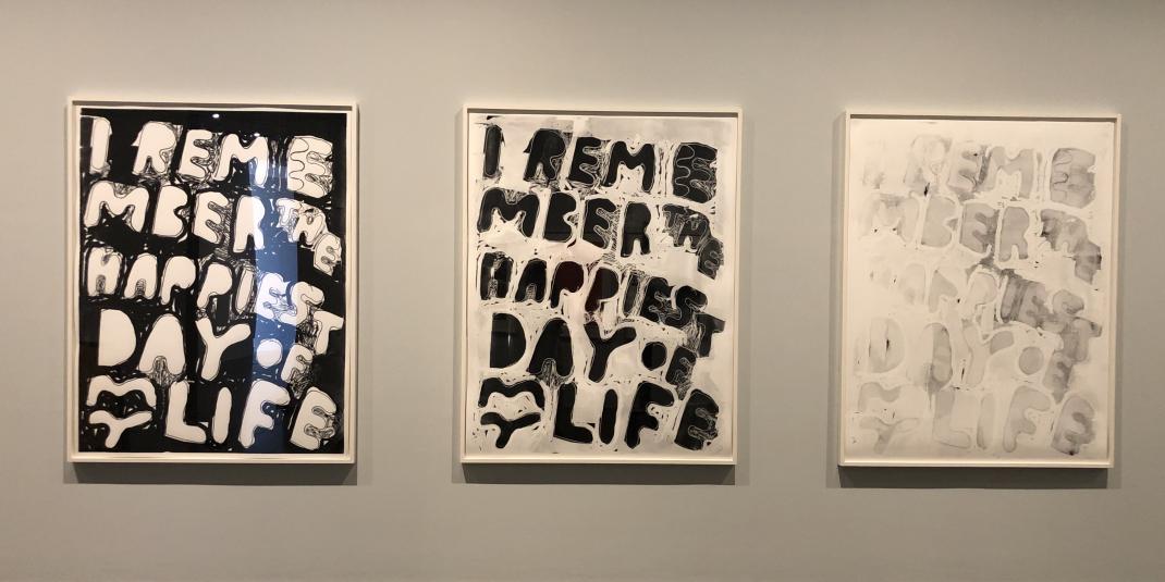
With artists working hand in hand with print workshops, the general fascination with series and serial strategies in printing shows no signs of flagging. Thomas Schütte (b. 1954) and Ulla von Brandenburg (b. 1974) like to play variations on theme and colour, while Dasha Shishkin (b. 1977) links methodological rules with narrative scenes and Stefan Marx (b. 1979) has developed a serial concept tied directly to the printing process.
GRIFFELKUNST AS »SERIAL OFFENDER«
The Griffelkunst-Vereinigung Hamburg has been publishing original graphic art editions since 1925, distributing the artworks from the start by way of print series. The aim is not primarily to produce formally or thematically self-contained series but to introduce the selected artists in a way that best represents their work through a selection of their graphic art. The association offers works by both established and newer artists as well as collaborating with printmakers. Lithographs, etchings, woodcuts and also photographs and inkjet prints are featured in its programmes, in which 4,500 members throughout Germany participate.
Artists selected by a jury are put in touch with print workshops where they can work directly on the litho stone, copper plate or wooden block and try out techniques that are new to them. One of the goals pursued by griffelkunst is to keep traditional artistic printing techniques alive while also raising awareness for the diversity of materials that can be used in graphic prints. The final print version of a series is created in a long process involving multiple steps – from the idea, to determining the right printing technique, to comparing test prints, press proofs or colour variations.